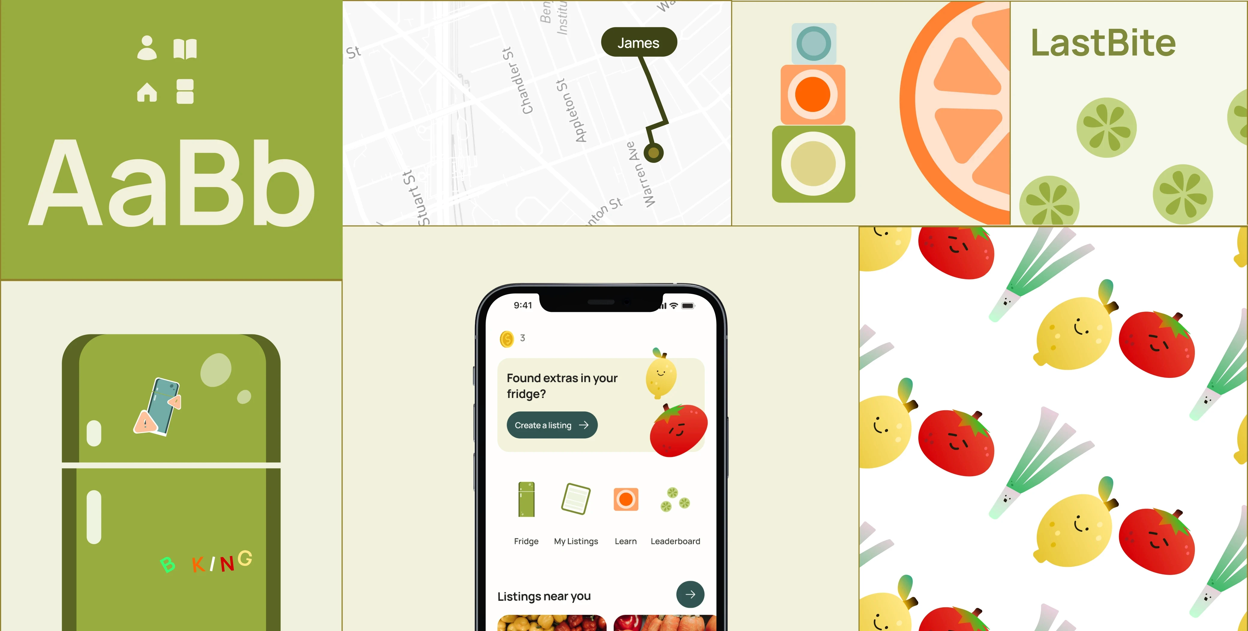
LastBite - A Visual System Built For Gamification
Illustration-led design system for a food-sharing app, built to make gamification feel fun.
DATE
2025
SKILLS
UI & Visual Design
Illustration
DELIVERABLES
Design System
Reusable illustration
Components
LastBite is a food-sharing app that helps people give extra meals a second chance. Originally started as an academic project, I later expanded it into a solo product design exploration, covering product research, real-user interviews, a mini design system, brand system, illustrations, and an interactive prototype.
This case study covers the visual system only. For the product thinking behind it, see the other Lastbite case study:
The context
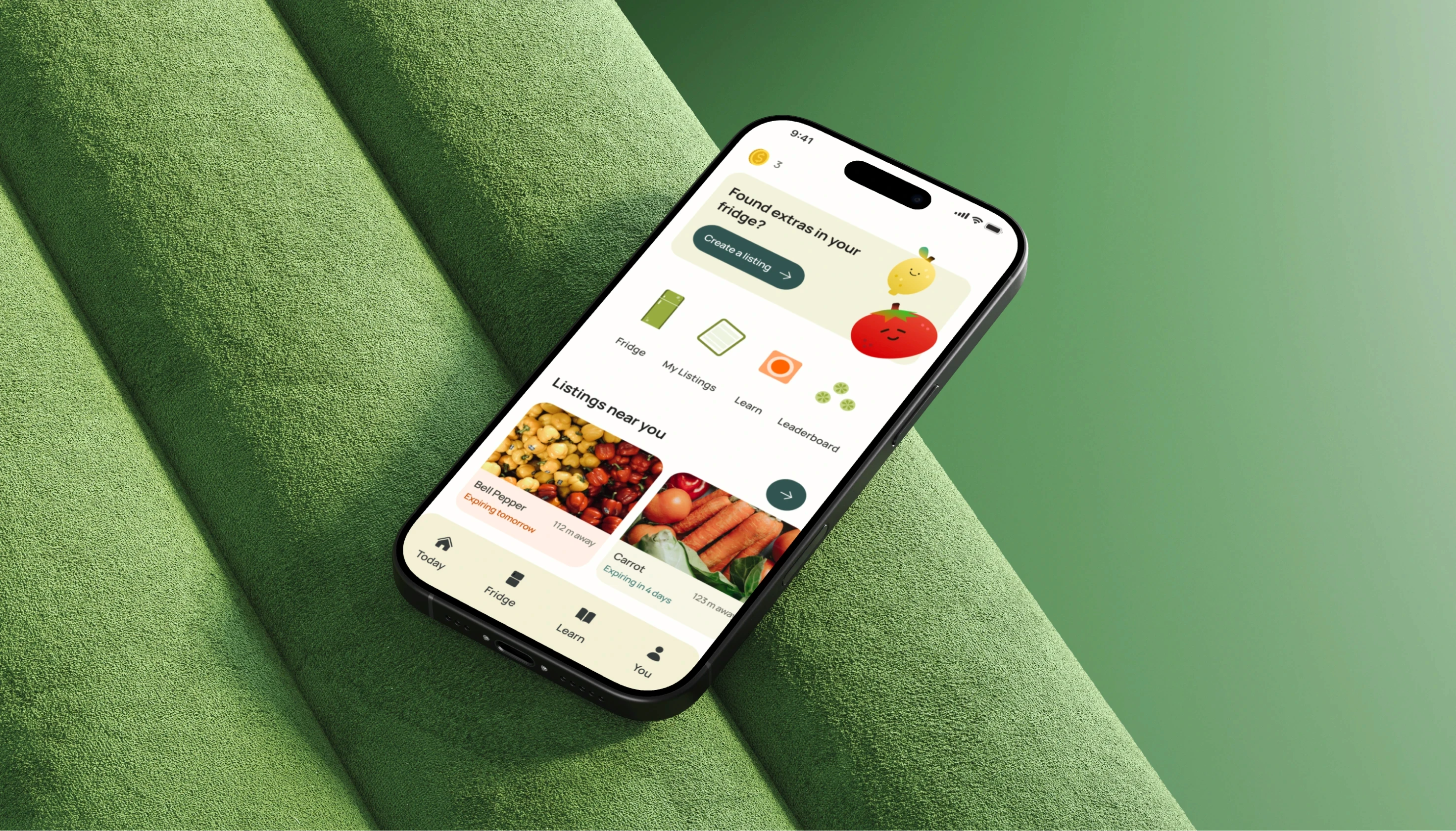
LastBite helps UBC students pass along extra food before it goes to waste. I used gamification, streaks, rewards, small wins, to give people a reason to check the app regularly before produce expired. This help them build habits that prevents them from having food waste in the first place.
The tension
Gamification risks feeling like a chore-app checklist with points for the sake of points. The goal was to make sharing food feel fun and engaging instead, something people wanted to open.
Why illustration
I wanted LastBite to feel warm and alive. The actual listings still use real photos of the food since that's what people need to trust what they're picking up items. However, I use Illustration to carry the brand feeling instead. These illustrations show up in onboarding, challenges, reward moments, and short lessons.
Selected Brand Direction

Finding the vocabulary
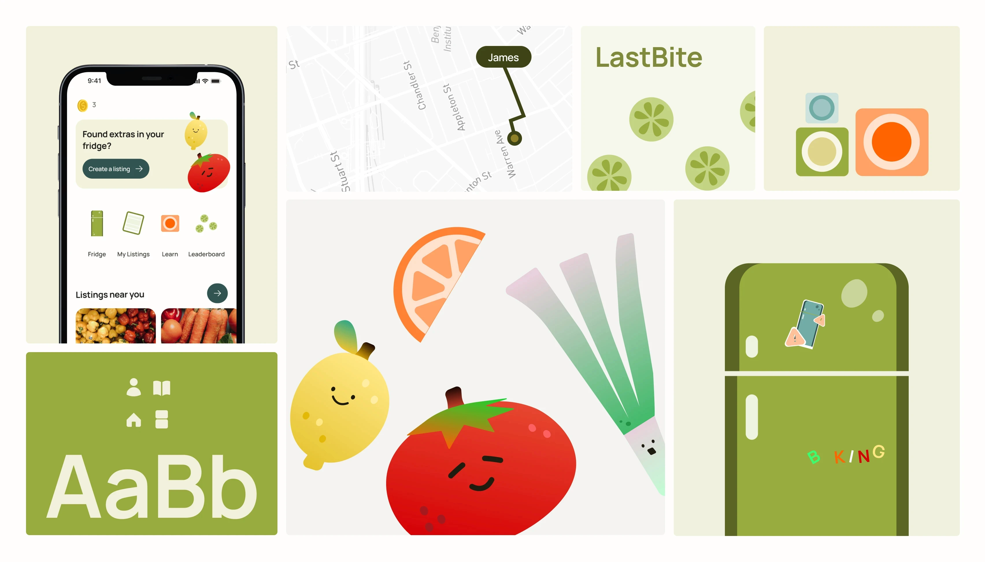
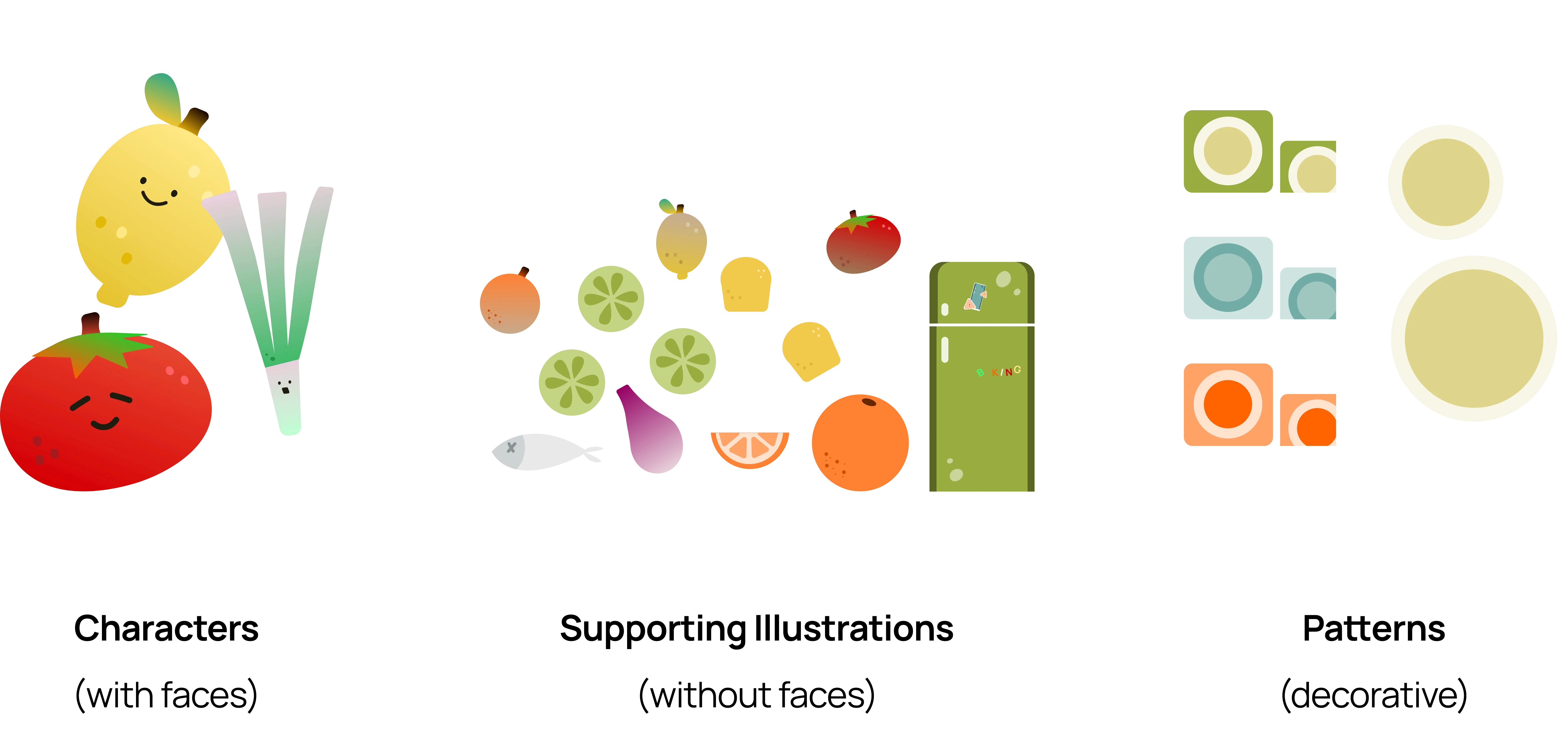
Before drawing a single final asset, broke the illustration language into categories: core characters, supporting illustrations, and patterns. Every future illustration pulled from that same set instead of getting reinvented screen by screen.
Building the system
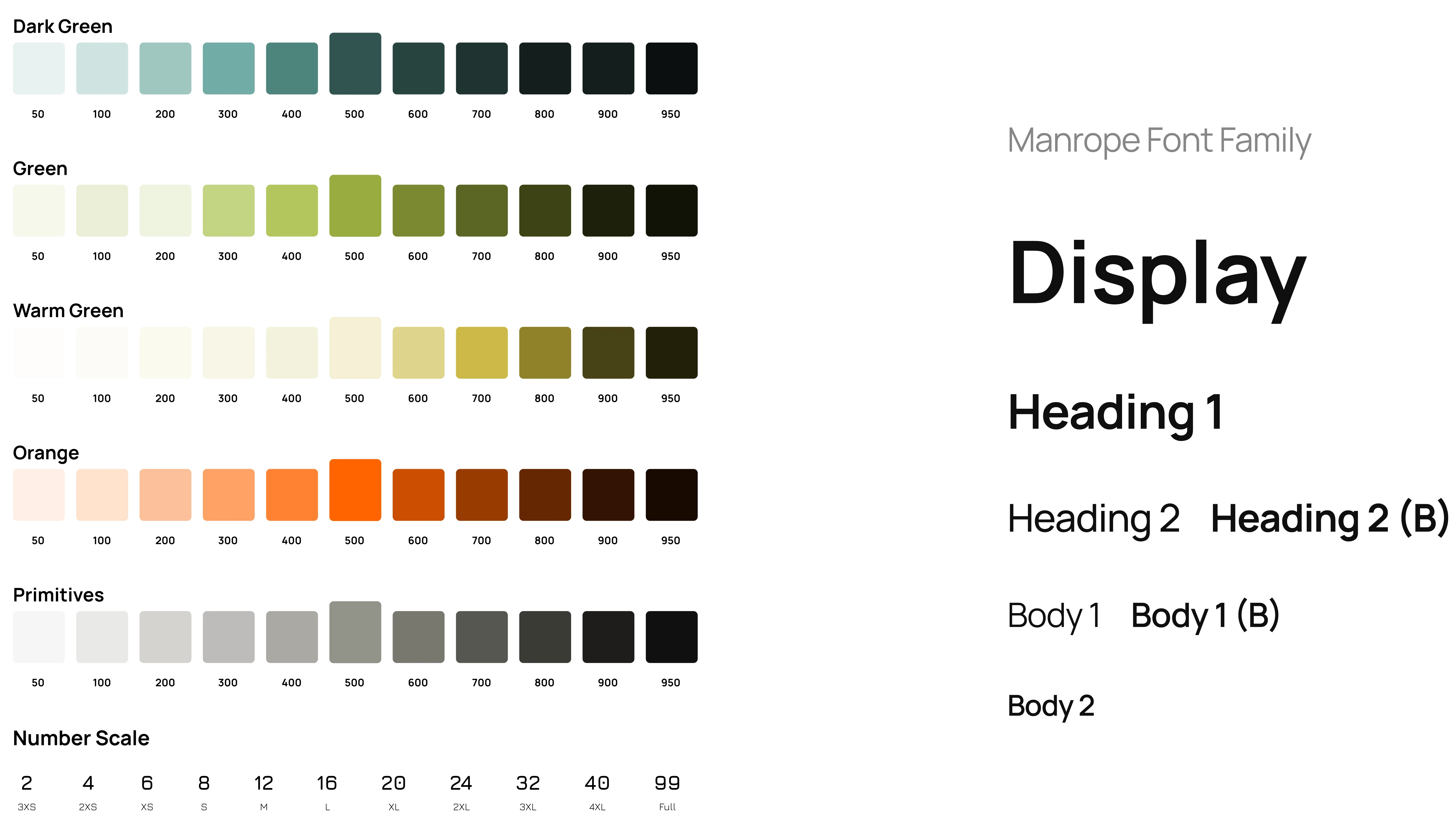
That vocabulary became an actual token system, 5 color families (green, dark green, pale green-yellow, two oranges, one grayscale), each carrying a full 11-step tonal range, plus a numeric sizing scale.
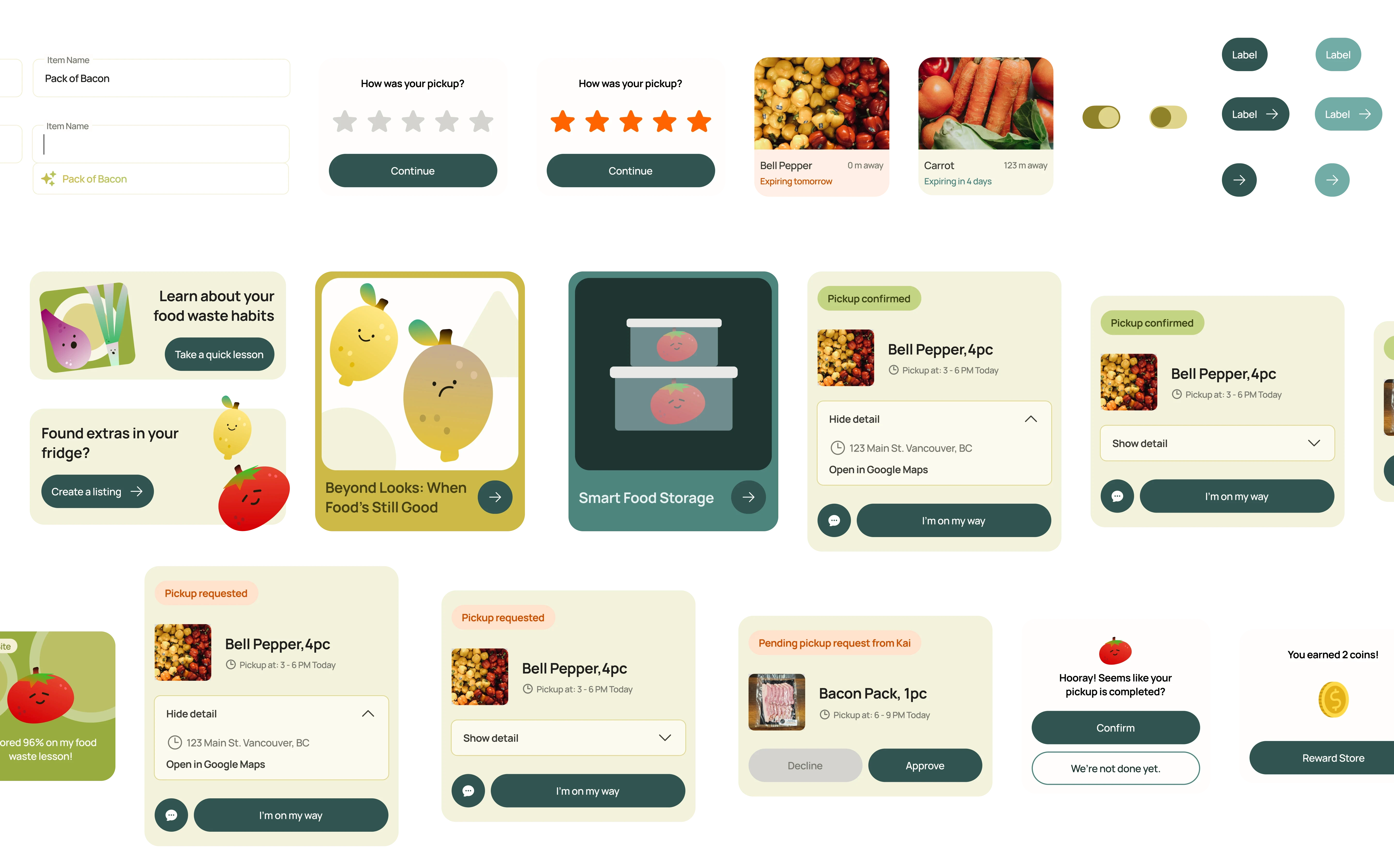
On top of that, a component library, text field, cards, and buttons across every state and color variant, built from the same system so a everything reads like the same product. I created 15 reusable components with variants covering edge cases.
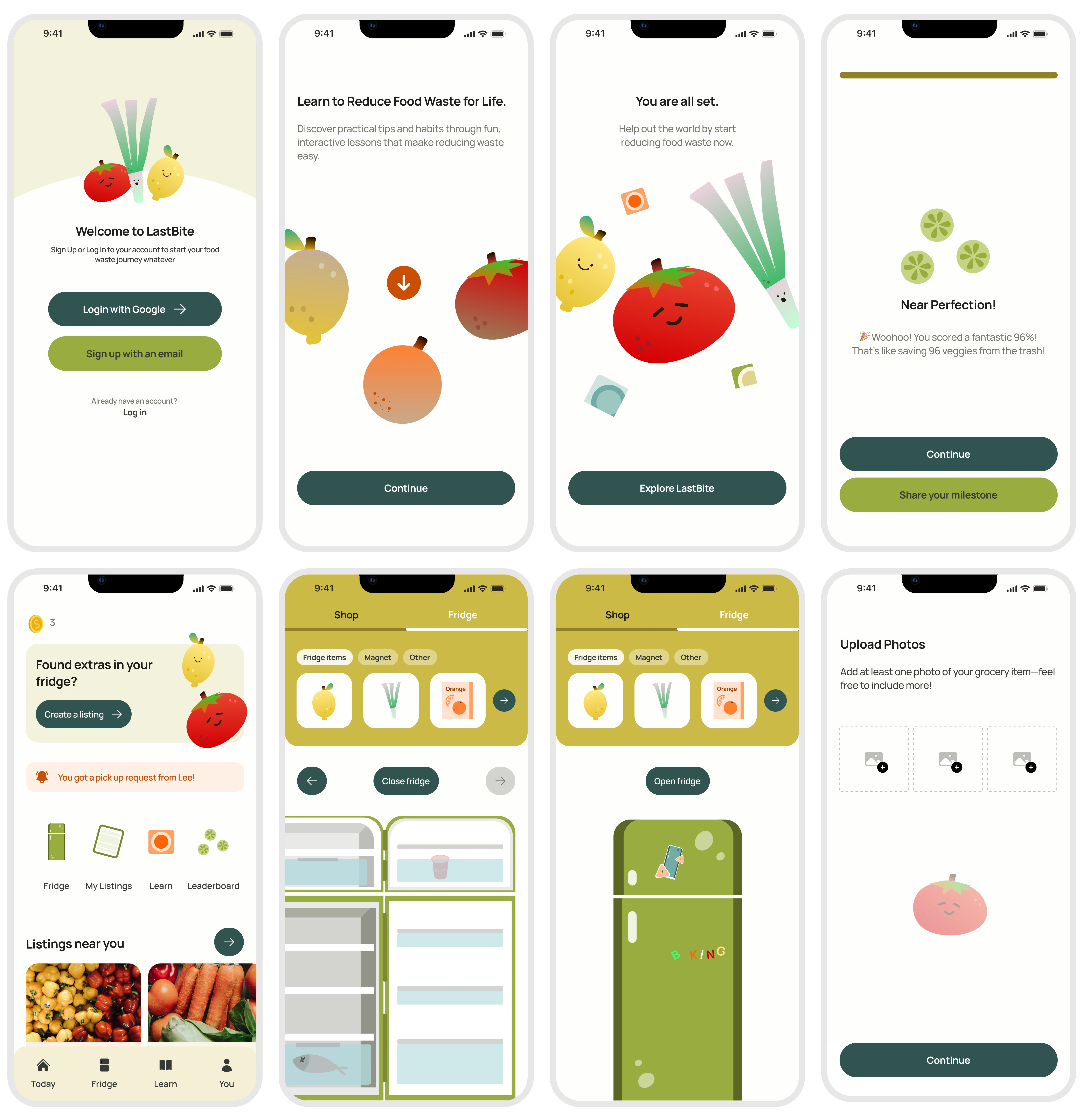
The system is applied across onboarding flow, log in screen, the reward store, fridge gamification flow, a shareable achievement card and more so the gamification could travel outside the app, not just live inside it.
Key Impact
The system scaled to 15 reusable components and a full illustration set, holding visual consistency across 40+ screens without rebuilding assets between iterations.
Reflection
I really enjoy building systems and seeing them work across different places. It feels a little like magic when a color rule, layout, or small visual detail shows up consistently across many screens without needing to be rebuilt and rethink every time.
I also see visual design as a big part of UX. Visual shapes how the experience feels, how people understand it, and how everything comes together. When the visuals have intention behind them, they become part of the experience.