Applied Science - Atom Design System
Atom is UBC Applied Science's design system for its websites and digital touchpoints. I contributed to it directly as a UX Designer in June 2025, then returned to extend it further as a self-directed project.
DATE
2025 (Contibuted)
2026 (Self-directed extension)
SKILLS
Component Design
Icon System Design
Documentation
TEAM
UX Designer
Component Contribution
Context
Before working on Atom, I was a graphic designer on APSC’s communications team and worked closely with the brand team. This made brand consistency something I already paid close attention to. At the time, the team was working to create a more cohesive visual identity across the faculty. When I later joined the web team as a UX Designer, we began reviewing our components to find areas where the digital experience could better reflect the wider brand system.
Component Design
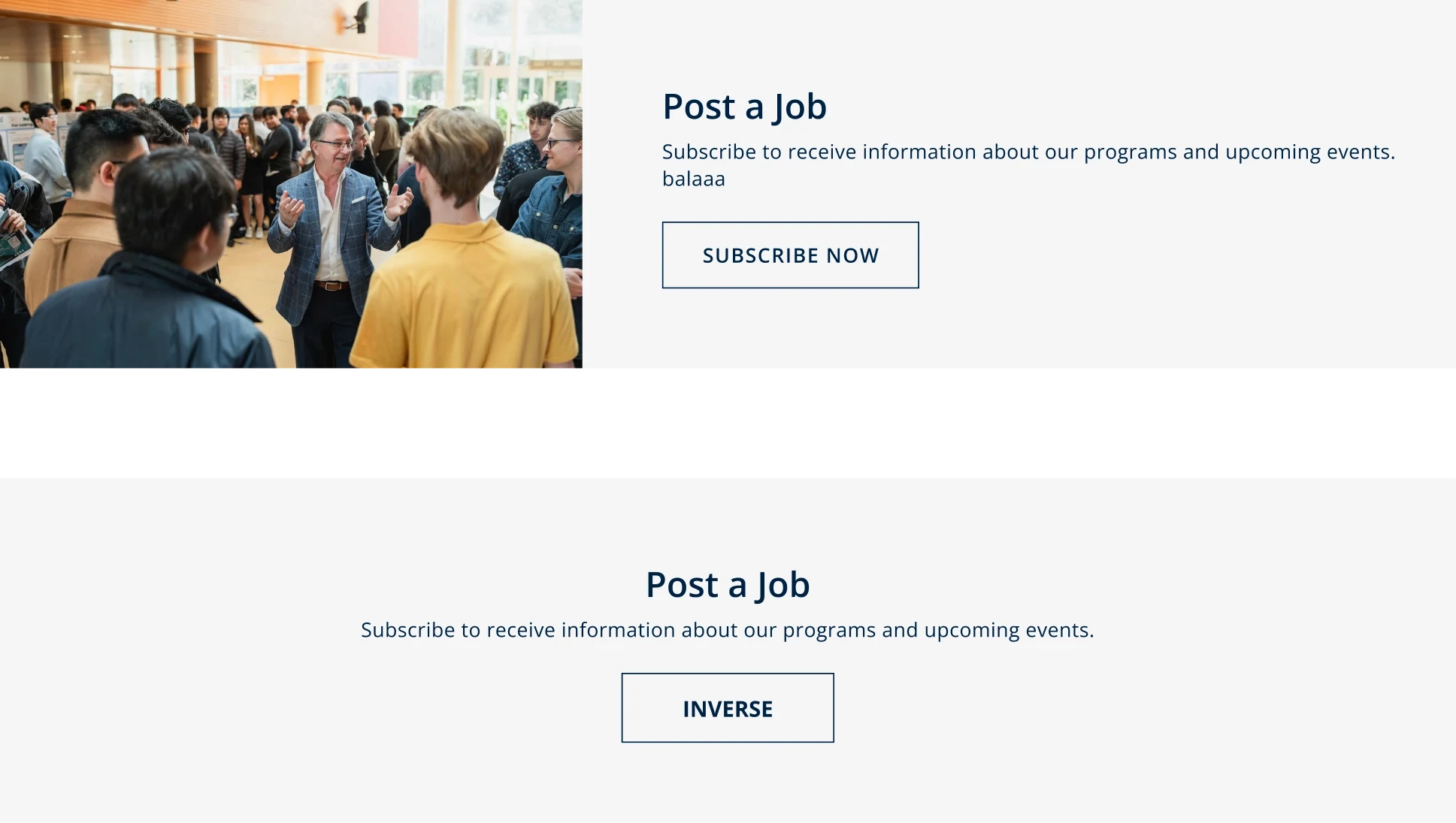
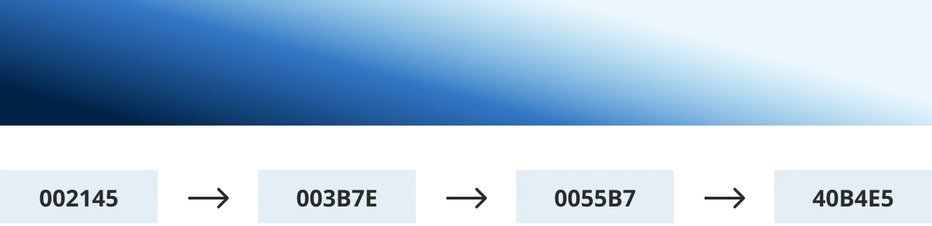
The CTA block became a focus during a portal project that used it heavily. While the existing component still felt somewhat on brand, its grey gradients and colour choices left room for improvement. I explored several directions before landing on a more intentional gradient treatment built around UBC’s primary blue. I then documented the component and prepared it for developer handoff.
Web
Mobile

Flagged for being visually generic as a CTA & no clear brand markers.
I explored a range of variations with and without photography, along with mobile versions. These are just a few samples from a much larger set.
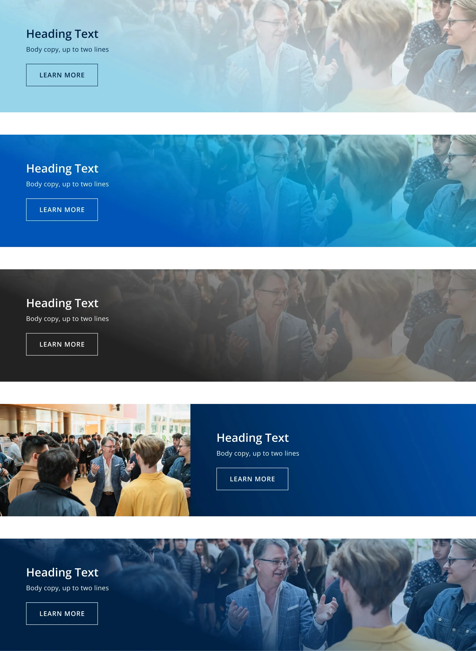
Used gradients to reflect the brand system
Tested UBC blues with light and dark text (accessibility)
Explored black and neutral fallbacks (not every APSC sub-unit uses the same blue shade)
Adjusted gradient strength for text length
Tested placement across images and no-image layouts
Web

Mobile



Self-Initiated Icon Exploration
Icon Gap
The CTA audit focused on one component that lacked a clear brand identity, but working inside Atom revealed a wider gap. The icons did not have a system at all.
Around the same time, I was asked to create an icon for a PDF file. There was no grid, stroke rule or shared reference to work from. We were not using one consistent icon library either. Instead, icons were often pulled from whatever source was available at the time or reused from previous work.
The PDF icon worked for that one use case, but it made the larger issue clear. Atom had individual icons created as they were needed, with nothing tying them together visually.
The CTA needed a stronger identity. The icons needed something more foundational. They needed a shared set of rules.
At the time, my scope was limited to creating one icon for one file. This self-initiated project picks up from the gap I had in mind.
Full case study coming soon
The icon system is complete. I’m currently putting together the full process, applications and documentation for this page.